UX researcher, UX/UI designer
Design audit, workshops, stakeholder interviews, UI design, visual design, documentation.
Over time, features have been developed in different products in the company that have generated technical and design debt, and because of this, there are clear inconsistencies both at the communicative level, at the visual level and at the production level (for example, same visual appearance but different code components).
The process is divided in 6 main phases: kick-off, discovery, concept, design, analysis and development.

In this phase, the team and stakeholders were decided, based on a stakeholder map process. After that, the team decided the schedule based on business goals and technical constraints.
Once we know the magnitude of the problems to be addressed and we are aware of the time and resources available, the team focuses its efforts on taking an inventory of all products and active components to date. At the same time, reports were created based on internal benchmarking and a secondary research was carried out to support decisions based on existing usability patterns, both in competitive products and in products from other industries.
Once we have all the information, both from stakeholders and from the research carried out, we begin to map all the modules that make up the components in order to "atomize" as many elements as possible. Thanks to this, and with the elements reduced to a minimum, the list of assets necessary to make up the first stage of the design system is created, to later elaborate the tokens.
The token system created is based on a hierarchy of levels (product - theme - base - modifier). With special detail at the "product" level, so we can assign tokens to different products, and "theme", since it allows us to create custom themes for specific reasons (e.g. different clients).

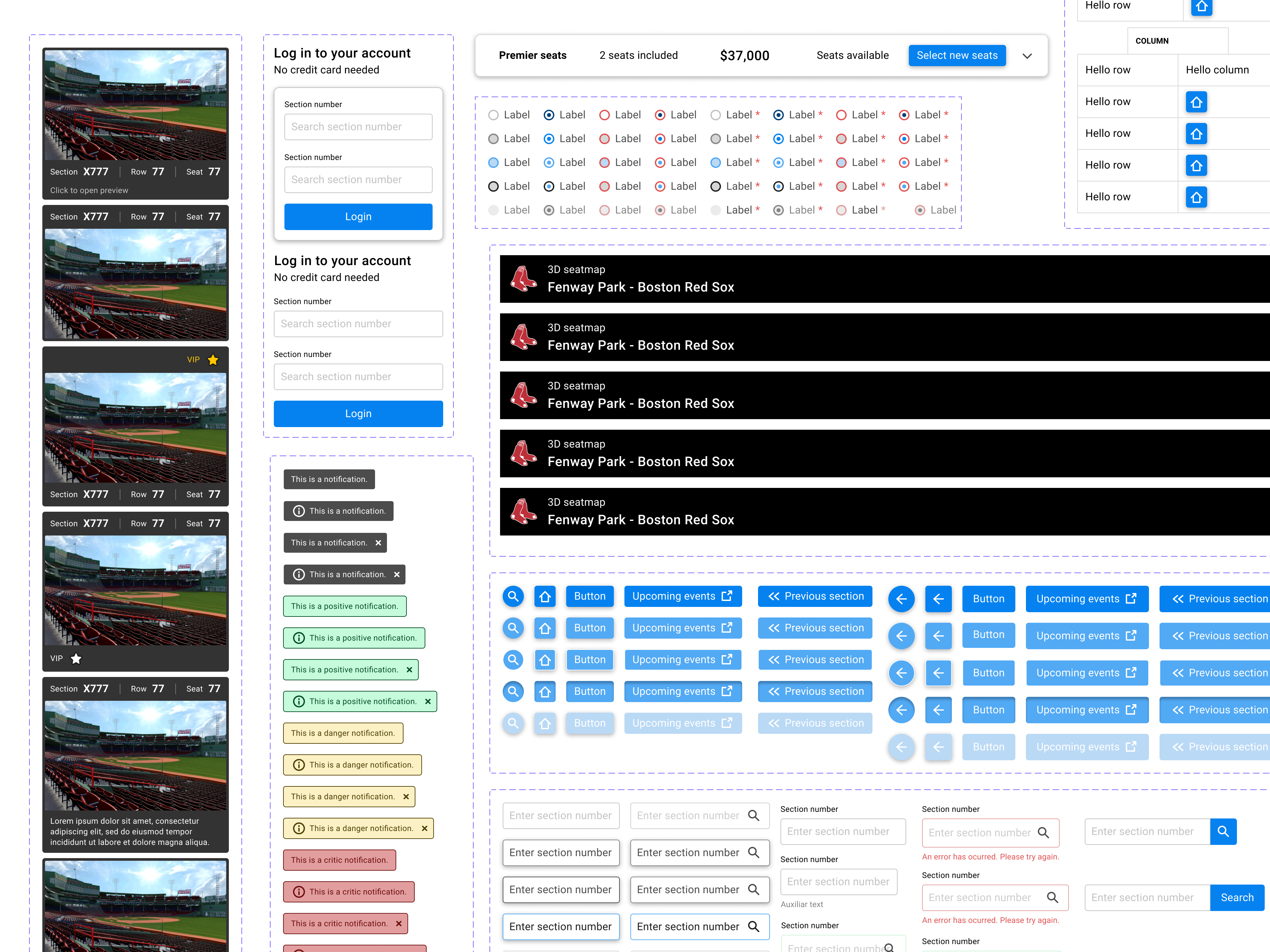
Once we had a consistent token structure, the main assets such as fonts, colors, sizes, etc were updated and prepared, along with the visual assets such as icons, illustrations, and imagery.


After documenting all the graphical and token parts, it was possible to start prototyping all the components and usability patterns established in the definition. In this phase, the tags assigned to the existing components were also reviewed, and new ones were assigned based on the business objectives defined in the roadmap and in the definition phase.

In a board presentation we show the results of the design system to stakeholders to do a pre-validation of the entire content summary. Subsequently, several tests were developed both internally and at the user level (since there were substantial changes in some components) to validate hypotheses and collect more data.
Once the value proposition was validated, the process was documented and a the team set up the process scope to make a progressive handoff for a correct implementation on the shipped products and a iteration plan.