Ideating a wayfinding solution for venues
Details
Role
UX researcher, UX/UI designer
Tasks
Competitive Analysis, focus group, prototyping
Achieved goals
- Reduced client door-to-seat time by average 26%.
- Succesfully monitorization of user behaviors in the stadium on the way to the seat (e.g. elevator use, most used routes, user efficiency).
Context
The main issue was to get the fans to sit without complications in a large stadium. This can be easy for people who frequent it or who are familiar with the logic of the circulation system of these places. However, a large number of people are not members, but people who will attend a single event.
Challenges
- Safely guide these people to their seats through all the level changes, corridors and vomitories.
- Increase user autonomy.
- Enhace venue pre-sale services.
Process
The process is divided in 4 main phases: divergence, synthesis, confluence and analysis.

Divergence
Research
The team focused on getting the maximum possible insights from two fundamental aspects: the architecture and the crowd flows, to be able to define patterns of user behavior in different spaces, and to be able to begin to detect the problems that can occur from the door of the stadium to the customer's seat.
Insights
Those are some of the most relevant insights to take into account for the development of the feature were the following:
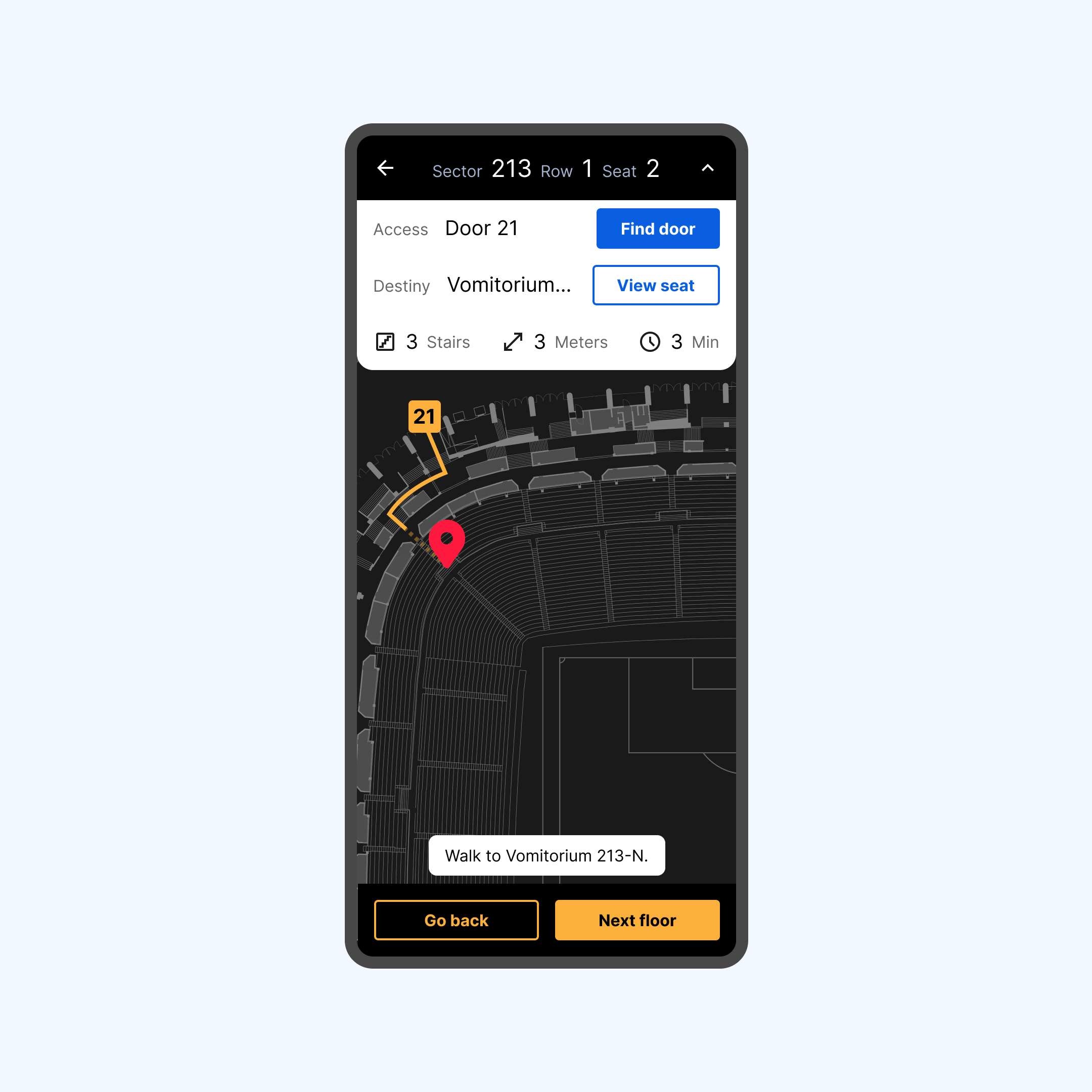
- The accessibility of the stadium must be represented on the map, (ramps, elevators, and services for the disabled).
- The user wants to know the entrance door closest to his seat.
- The user must be able to choose the type of route (by stairs, or by elevator).
- The user must be able to consult services along the way (WC, shops, restaurants).
Synthesis
Problems to solve
Some of the HMW we used to elaborate the features:
- How might we increase user confidence when walking tought the stadium?
- How might decrease the time to reach the seat?
- How might we show routes with different levels?
- How might we track user success?
Hyphoteses
We elaborated hyphoteses based on all the data gathered, and aligned with the data we wanted to gather from the users, in order to start defining KPIS.
Definition
After a few workshops, we defined the most needed features based in a A/E matrix, and started with the elaboration of the concept tests for the user flows.
Confluence
User flows & wireframes
The team developed a low-fidelity prototype to test and analyze how the user behaves when interacting with the map, in order to define the type and amount of information to be displayed during the journey.
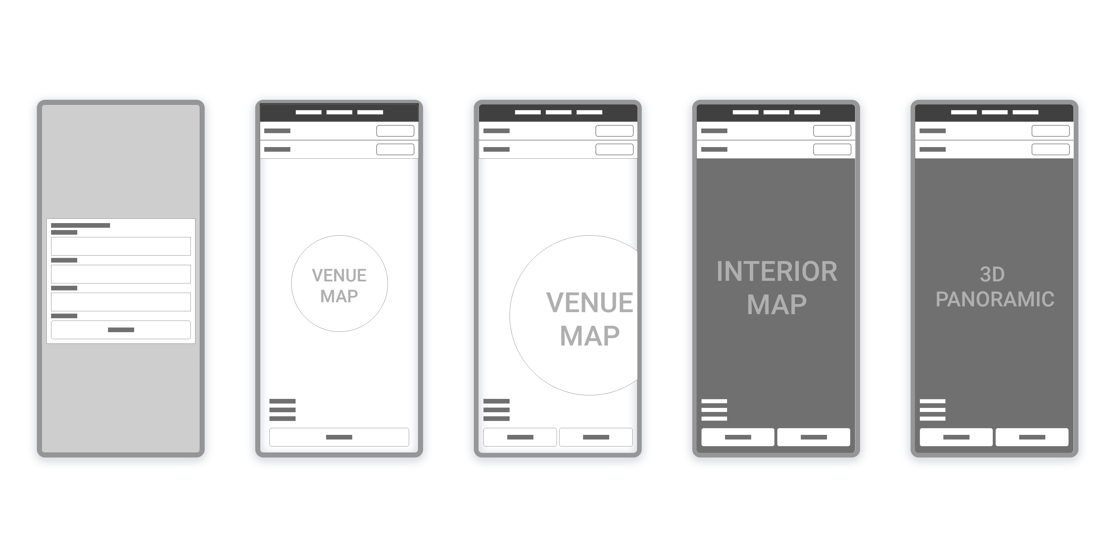
Prototype & test
The components are made with applied design and A / B tests are carried out to implement performance and usability improvements (e.g. allow the user to have more information needed on their journey like time, distance, or stairs, taking into account different cohorts of users).