New digital signature request list experience
At Signaturit, I led the redesign of the request list experience, the platform’s highest-traffic surface and a core operational tool for customers managing large volumes of signature requests.
Rather than treating this as a UI improvement, the work addressed a systemic mismatch between information architecture and users’ mental models, which was impacting trust, efficiency, and long-term adoption.
🚫 Due to data policy with the company, detailed information on some specifications, processes or designs is not provided.
Impact
-1.2
perceived difficulty score
25%
faster information scanning
~17%
Credit consumption increase estimated
- Increased user confidence in managing high-volume signature workflows.
- Faster scanning and decision-making in a critical operational surface.
- Reduced cognitive load by aligning with familiar, inbox-like mental models.
- Positive downstream impact on conversion and credit consumption.
- Improved maintainability and scalability of a core UI component.
Summary
🧍🏽
11 participants
✏️
1 designers
👥
3 teams
⌛
2 weeks
Situation
The request list is the most visited screen in the product and functions as an operational control center for many customers. Some accounts manage hundreds of active requests per day, making even small inefficiencies compound quickly.
Research and internal signals showed that users lacked confidence in the state of their requests, especially in the absence of explicit notifications. This uncertainty translated into stress, repeated checking, and reduced trust in the system.
Tasks
- Identify the structural causes behind user uncertainty, beyond surface-level usability issues.
- Understand how users build context and confidence when managing large volumes of requests.
- Align the experience with scalable mental models used in adjacent tools (email, inboxes, task lists).
- Deliver a solution that could be validated quickly and extended safely over time.
Actions
Synthesized insights from user interviews, CS feedback, and sales input to frame the problem systemically.
Led pattern analysis to identify alternative, common information hierarchies in the user ecosystem.
Facilitated an information architecture workshop to surface users’ mental models.
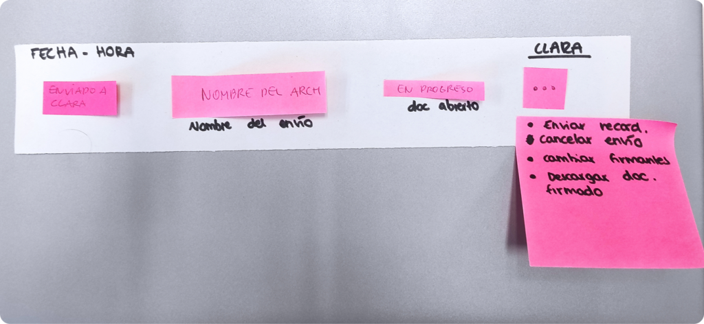
Defined principles focused on scanability, comparability, and decision confidence:


Results
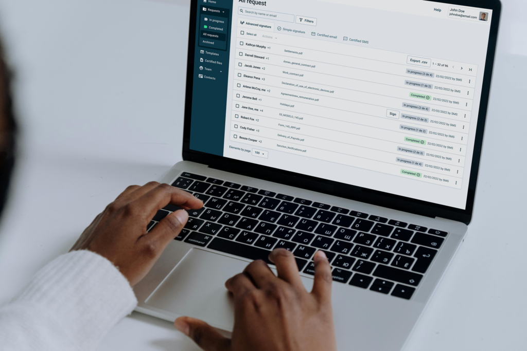
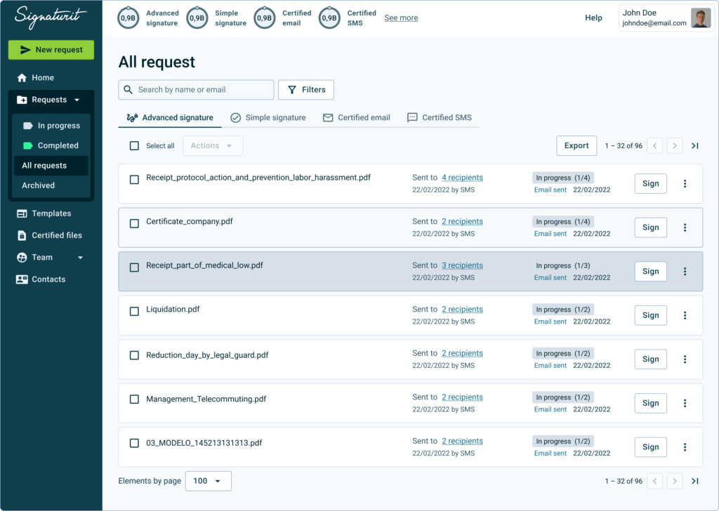
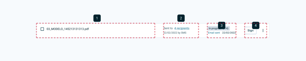
Partnered with engineering to redesign the architecture while reducing component complexity, from this:
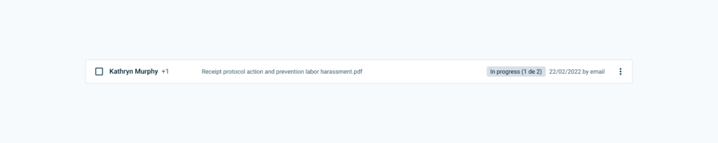
To this, increasing information density without sacrificing clarity:
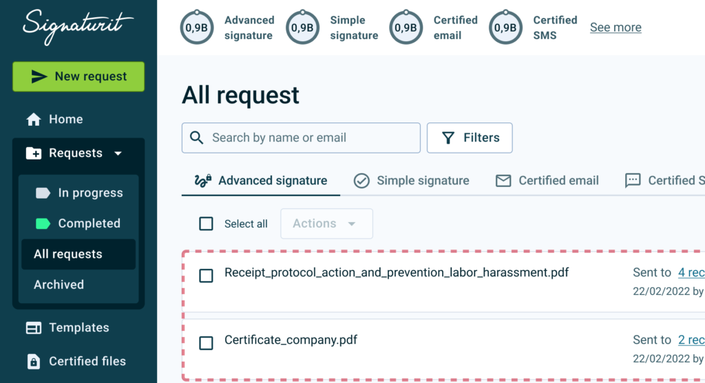
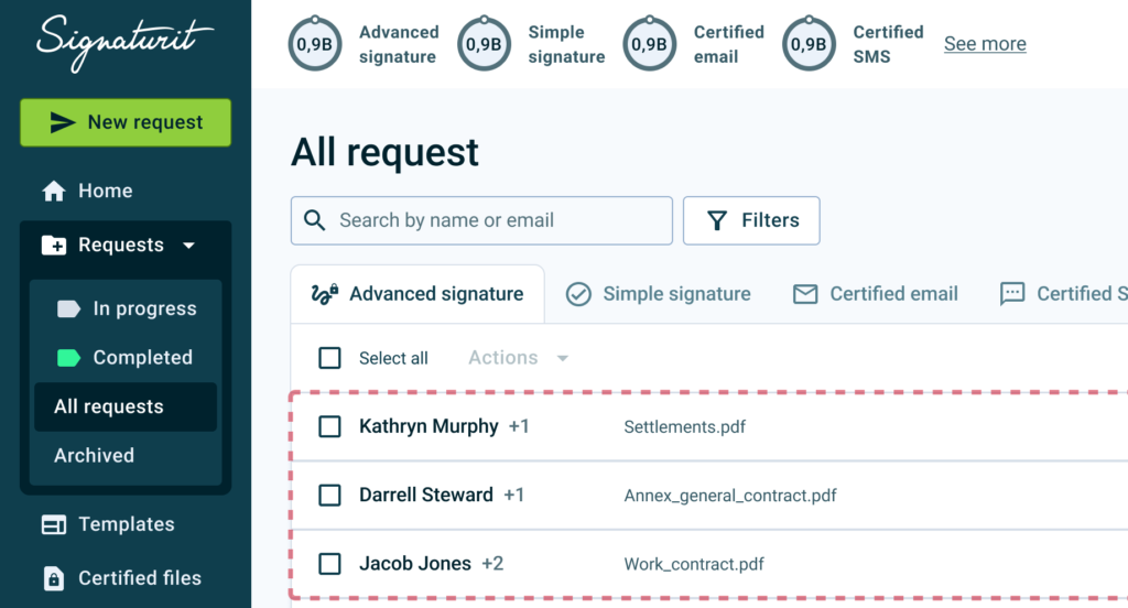
Improved ability to compare multiple requests within the same view:
- Users located critical information faster and with less perceived effort.
- Strong qualitative validation from users and internal stakeholders.
- A leaner component structure supporting future extensions.
Next Steps
- Validate performance in extreme usage scenarios with large recipient sets.
- Measure long-term confidence through in-app surveys.
- Apply the same mental-model-driven approach to other core product surfaces.
Thoughts & Self-reflections
- Early user involvement is fast, low-cost, and highly effective.
- Well-structured workshops are a powerful way to uncover real mental models.
- Small changes in information architecture can have a significant impact on user confidence and efficiency.
- Aligning product patterns with familiar tools in B2B tools (email, inboxes, chats) reduces friction and learning effort.