Stadium visitors, especially those attending a one-time event, often struggled to find their seats due to complex architectural layouts with multiple floors, corridors, and vomitories. The existing experience lacked guidance, creating confusion, stress, and bottlenecks.
🚫 Due to data policy with the company, detailed information on some specifications, processes or designs is not provided.
Impact
4.2
User confidence score in finding their site
-35%
Less time to move to assigned seats
-24%
Less assistance by users registered
Task
Design a user-friendly wayfinding system that enables all attendees, regardless of familiarity with the venue, to independently and safely navigate from entrance to seat. The system also needed to enhance pre-sale services and provide useful venue information throughout the journey.
Action
Conducted UX research, benchmarking, and card sorting to understand user mental models and expectations.
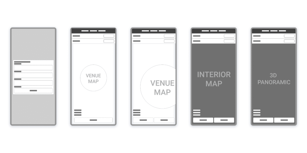
Designed wireframes centered around a map-based system, iterated through user testing:
Wireframe of the first prototype, containing the user journey from the seat finder to the 3d view of the seat.
Developed a step-by-step navigation flow with:
3D visualizations of selected seats.
Indoor and outdoor navigation maps.
Information overlays to enhace location context for the user.
Adapted the solution for both desktop and app platforms to ensure accessibility.
Result
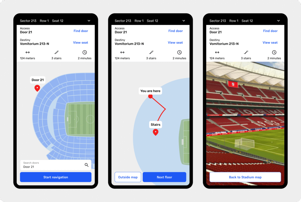
Wi-fi screens with iterations. From left to right: inside map navigation view, 3D view of the chosen seat, and outside map view.
Delivered a working prototype of a product, wich is capable of guiding users through a stadium of over 80,000 seats, from optimal entry point to final seat.
Improved user autonomy and reduced the reliance on staff assistance for venue users.
Interface iterations based on jobs-to-be-done analysis addressed diverse user cohorts, incorporating detailed wayfinding data for better decision-making.
Further testing
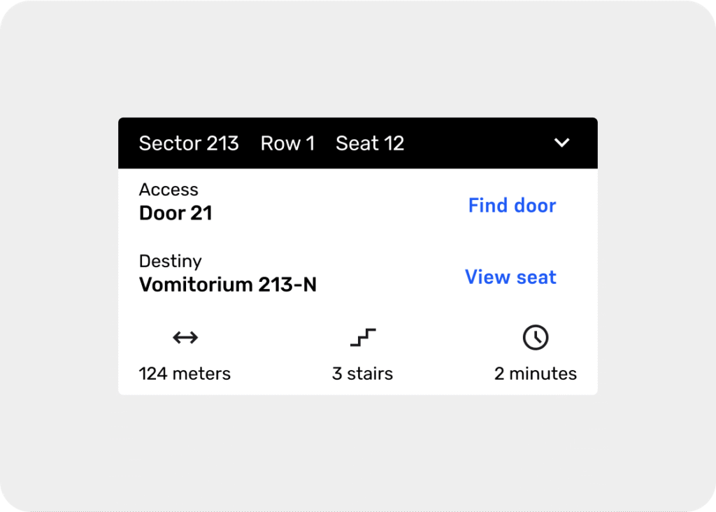
Later in an analysis of the jobs to be done, iterations were made to improve the interface and allow the user to have more information needed on their journey (time, distance, stairs), taking into account different cohorts of users.
By balancing decision freedom and optimized filtering, EventQuick might elevate the user experience for high-stakes ticket purchases, empowering users like María to act fast, feel in control, and secure the best seats with confidence.
🚫 Due to data policy with the company, detailed information on some specifications, processes or designs is not provided.
TL;DR
User-focused flow: Designed around María’s need to reserve premium seats for conferences, the app prioritizes ease of use, speed in payment, and clear seat selection through an interactive map and smart filters.
Market-driven decisions: Analysis of 8 ticketing platforms led to UX patterns like card-based navigation, bottom CTAs, and “best seat” filters to minimize friction.
Success metrics: Conversion time, satisfaction rate, and dropout rate are key to evaluating performance; testing is recommended to validate assumptions and user mental models.
Impact
Improved confidence during premium seat selection.
Faster decision-making in time-sensitive purchase flows.
Reduced cognitive load through map-based navigation and smart filtering.
Clearer path to conversion for high-value ticket purchases.
Strong foundation for measuring and optimizing funnel performance.
Context
María, 26 years old, needs to purchase tickets for an important conference from her mobile phone through an app and she is very interested in being able to reserve the best seats in the event room for herself and two friends.
Questions we need to ask
What is Maria’s background?
Is this the first time that María buys tickets on an app? Is it something specific, or recurring?
What is the entrypoint of the funnel?
Where is the most friction generated in the flow?
Hyphoteses
Considering that it is a conference, we assume that the seats in the room are limited, so we have to take into account the exclusivity of these.
The process must include a payment gateway where María can pay as quickly as possible, so that she does not lose her seats.
Since we do not know María’s technological background, the interface has to be as simple, standard and direct as possible.
We assume that Maria wants to buy “the best seat” in terms of quality, regardless of its price or features.
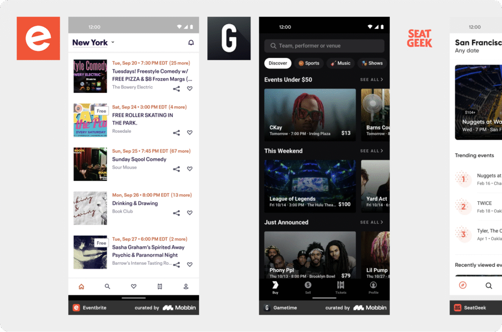
Benchmark
8 applications related to the sale of tickets, seats and payment gateways have been analyzed, taking into account information architecture, structure, navigation flows, etc:
Logos of the benchmarked companies.
The benchmark has focused on looking for patterns that can help María solve her problem, based on the following needs:
Maria needs to view and select seats.
Maria needs to view and select entries.
Maria needs to be able to pay instantly or, at least, with as many options as possible.
Benchmark highlights
Companies and patterns that are actually solving the problems we want to solve.
Predominance of the use of cards to navigate between events.
Predominance of the use of maps to navigate between seats. In other cases, lists are used.
In few cases we see that the problem of finding “better entries” is solved in a direct way, without the user having to search for them.
Predominance of navigation and CTAS at the bottom of the screen.
User goals
Like María, a 26-year-old young woman, I want to buy tickets for an important conference from my mobile phone through an app, so I can reserve the best seats in the event room for me and two friends.
Acceptance Criteria
María must be able to search and select the conference in the app from her mobile.
The app must show an interactive map of the seats available in the event room.
Maria must be able to select and reserve three adjacent seats in the best available locations.
The app should allow María to complete the purchase of tickets directly from her mobile phone.
María should receive confirmation of her purchase and seat reservation, along with the digital tickets.
How we measure success
We will know that the solution works if Maria can select the tickets and complete the purchase without problems. Additionally, to improve your experience in future iterations, we will need to measure, among others:
Conversion time.
Satisfaction rate with the process.
Scroll distance.
Average ticket.
Dropout rate.
Type of purchased events.
Happy path
1. María downloads and installs the app from the app store.
2. María registers or logs in to the app.
3. Search for the conference in the app and select it.
4. Choose seats for her and her friends on the interactive map.
5. Enter your payment details and confirm the purchase.
6. Receive purchase confirmation and access your digital tickets in the app.
Wireframes
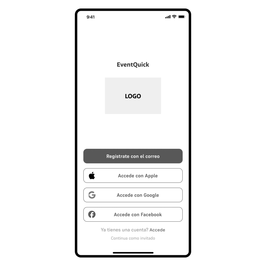
We offer multiple login options for María so she can access as quickly as possible. We also give the option to enter as a guest.
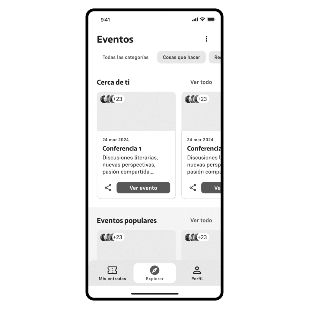
We show you a landing page with different events, divided into categories, to encourage discovery and navigation.
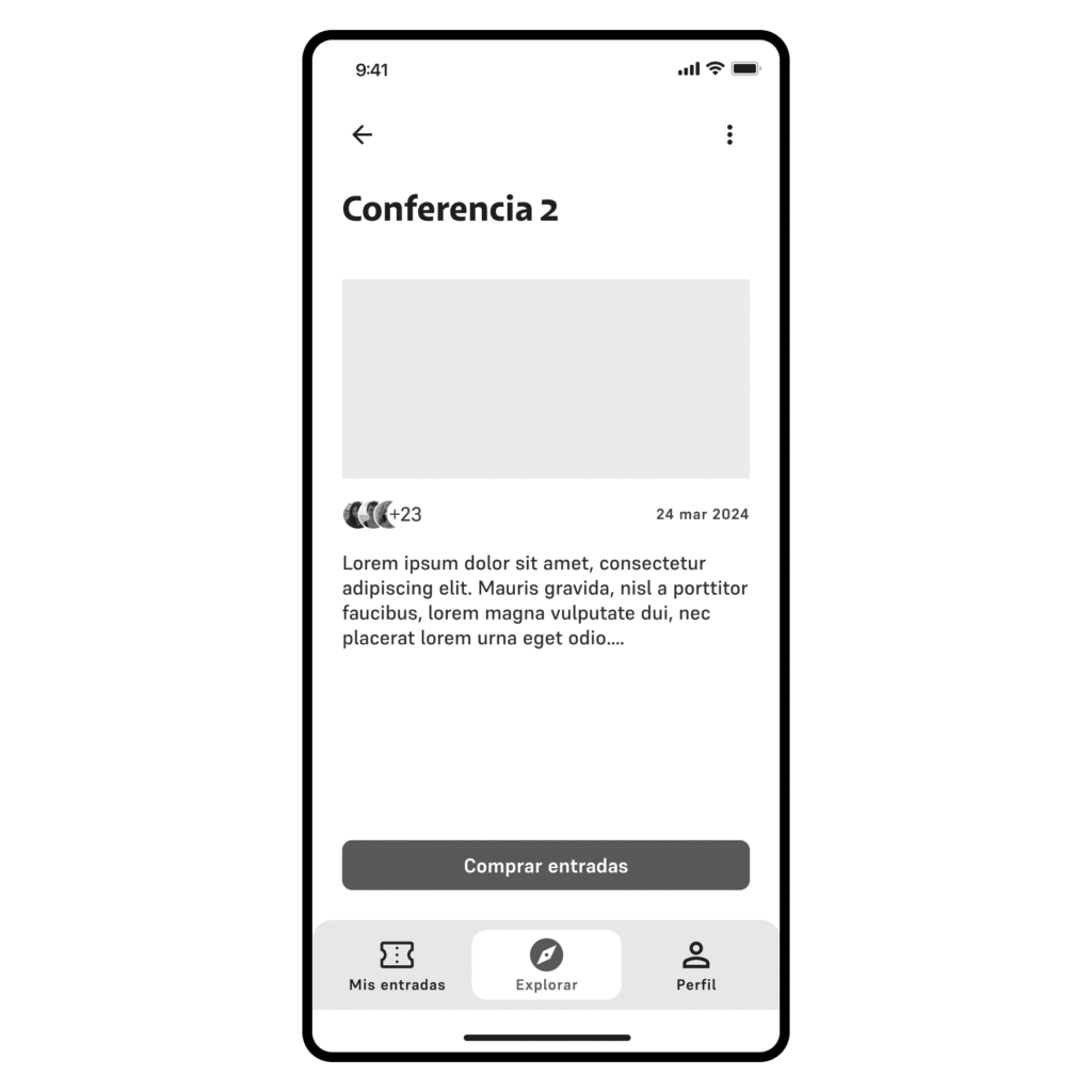
On the event page, we can add information (to be defined) and find the entrypoint to purchase tickets.
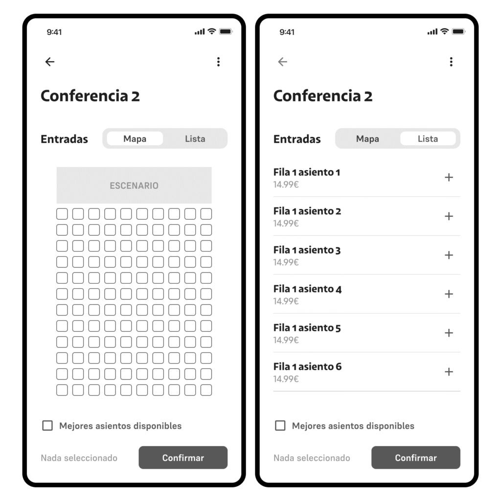
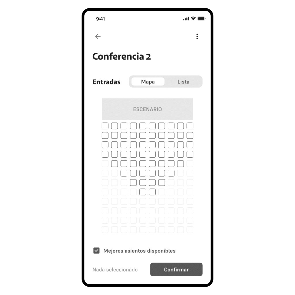
You can search for your preferred seats on a map, or in a list.
You can also apply a filter of best available seats; In this way, the best seats are shown based on proximity to the stage and position and distance (the most central seats have been considered best)
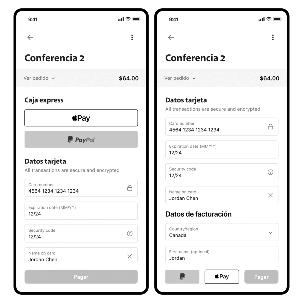
Once the seats have been selected, It is passed to the payment gateway. At first, it was proposed to add quick payment options at the top of the interface, but an iteration was carried out to unify the payment methods in the same cluster. Once the purchase is made, the user could access the “my tickets” flow, where they find all the details of their events and purchases.
The proposal made offers both freedom of decision and specific filtering of seats, thus being able to improve the conversion.
Using the map and the list can reduce cognitive load in scenarios where tickets and seats are limited, and Maria has to make a quick decision.
To guarantee success, it would be necessary to carry out user tests of the proposals to confirm that the mental models worked on adapt to those of María, and to begin collecting metrics that support the decisions made.