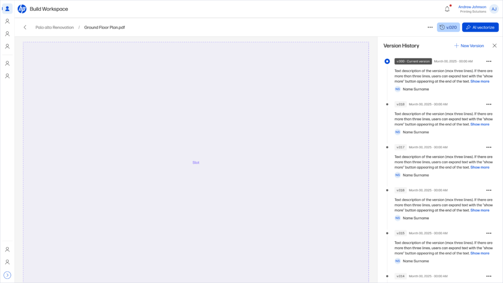
We designed and implemented a Plan Version Control feature for HP Build, a cloud based management platform for constructors and architects (ACs). This feature allows users to upload new versions of drawings, track changes, compare revisions, and approve the latest plan. It reduced errors from outdated documentation and improved collaboration across architects, engineers, and contractors.
Impact
30%
Faster turnaround for issuing and approving revisions.
🗃️
Significant drop in onsite mistakes due to outdated plans.
🤝
Improved trust among project stakeholders: “everyone is working on the same page.”
Context
We know that construction projects involve frequent changes to drawings. With no version control, teams manage files manually through naming conventions, physical plans and shared folders. Here is the architect’s jobs to be done:
Ensure the drawing is the correct version.
Identify changes and issues quickly and accurately
Communicate issues clearly, visually and contextually
Assign responsibility + Ensure recipients knows what to do
Keep traceability of decisions and changes + ensure issues are resolved
This cause confusion about which plan is the latest, create errors onsite, and made it hard to track accountability for changes. But is there any opportunity for us to solve that problem?
Solution explore
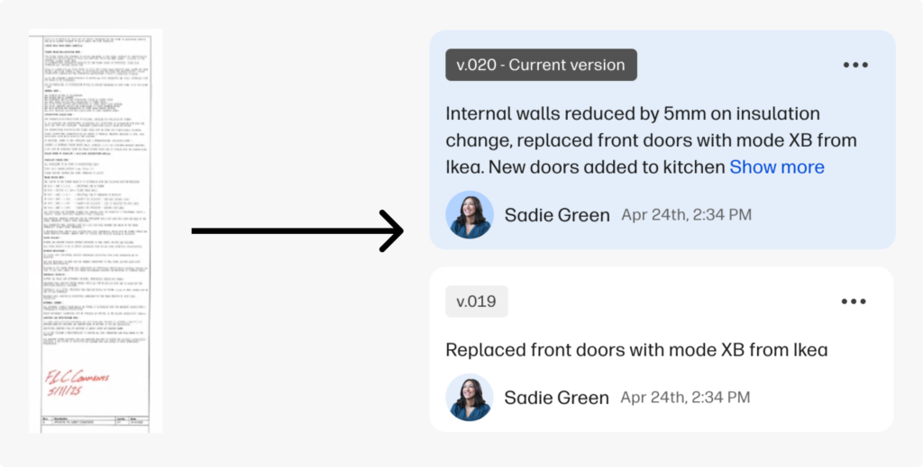
The principal design challenge was to translate the context from the review box that architects use to track changes in their drawings, to something easily scanable, data-rich and scalable.
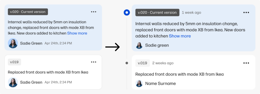
Version design card based on the drawing review box.
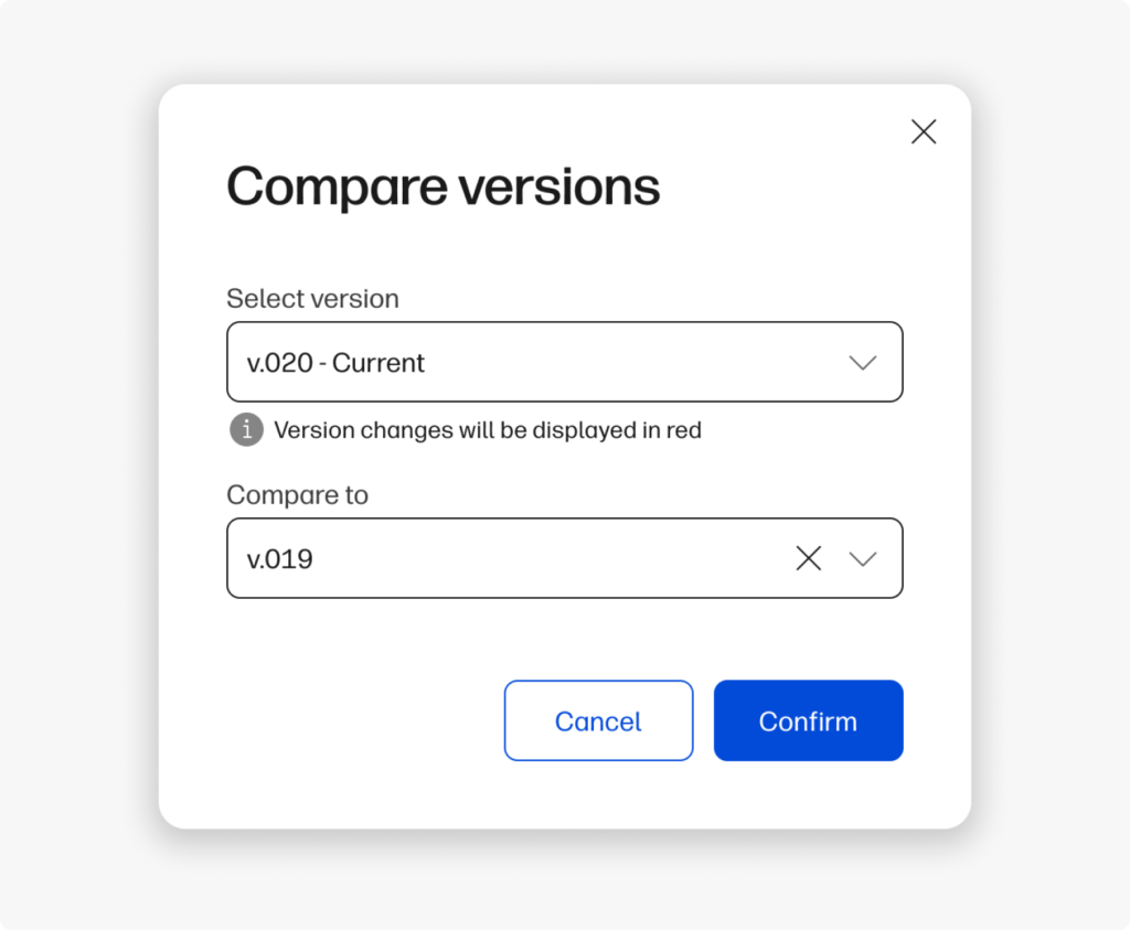
The drawing comparison allowed users to select two plans and compare them.
Then we provided a drawing comparison prototype to see how users are managing differences in drawings, and how they expect to communicate decisions and design changes.
Also, we wanted to understand what preferences does user have when they need to compare two different files, in order to detect differences in the most efficient way.
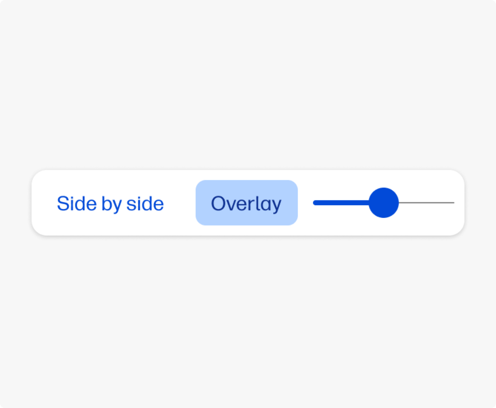
The comparison component allowed users to choose between side to side and overlay comparison, with a opacity slider to help highlight the differences in both drawings.
Research
We tested the interface with users to validate the mental model and the information hierarchy.
We conducted user interviews with ACs. Our goals were:
Validate if A/Cs perceive value in managing and collaborating on always updated drawings.
Show a first design stimuli, checking that they understand our approach of version control use as a central part of the flow and how they would use it.
Key takeaways
Both Architects and Constructors state the drawing is the nexus of a project. Architects needs markup and collab features, while constructors needs pins and task control, yet they both agree that version comparing is a must.
1. The platform must be easy to use
Professionals are hesitant to adopt complex new systems that require extensive training. They need for a simple, intuitive, and highly visual interface:
“I think would be very beneficial on the client end because I think it… doesn’t seem like you have to be in our industry to understand what’s happening or how to use this.”
2. Communication is at the heart of any construction project, but traditional methods are often inefficient
The users emphasize the desire for tools that streamline communication, automate reminders, and allow for quick, direct collaboration:
We like to communicate quickly, and usually it’s just a team’s message: ‘Yep, okay, blah, blah, blah, do this,’and that’s it. It clicks!
3. Projects change constantly, and it’s critical for all stakeholders to be working from the most current set of drawings and plans
Users highlight the need for a reliable system that tracks changes, prevents costly mistakes, and ensures everyone is using the correct documents:
“If you could… drag [the drawings] one to one side and one to the other… so you can see what has actually changed.”
Opportunities and Action Items
1. Version control is a common pain for all users
We are validating the gap of a centralized versioning system throughout the project: while architects look for a simpler alternative to complex tools like Bluebeam, builders need practical control and traceability adapted to the work.
2. Enhance communication capabilities to foster communication
All users experienced communication problems in different phases of the projects, that beign a major pain and potential economical loss.
3. Our information architecture ure approach fits the user mental model
Users expected to see and interact in the same way we thought they would.
Final solution
Collaborating with the design system team, we adapted the design to comply with the system guidelines and improve accessibility and information hierarchy.
Comparison from the design stimuli presented to users (left) to the new proposal with a timeline and different information architecture (right).
We also standardized the versioning pattern in the design system for other products
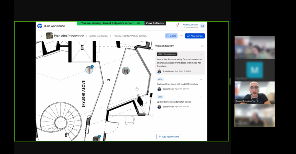
We allow users to fully view version changes while they have full view of the drawings they are working with.
To wrap up
What went well
We managed to offer a solution to a common problem in a daily task for architects and constructors.
We made a significant contribution to the design system by standardizing a component that can be applied to different products.
What could been better
The urgent distracted us from the important, and made us focus resources on different product features more aligned with the business but less aligned with the daily-basis issues of our users.
We understood that we need to map and address other user challenges earlier so we can bring value to the users in a more efficient way.
This case study presents a possible solution to the friction points detected by the team in the forms and configuration settings from different funnels.
🚫 Due to data policy with the company, detailed information on some specifications, processes or designs is not provided.
Summary
🧍🏽
11 users
✏️
2 designers
👥
4 teams
⌛
2 weeks
Impact
🧍🏽
Generated a better understanding of user input and expectations by changing a setting.
📈
Defined potential resource savings in customer service and support by improving user productivity and reducing the learning curve.
🧑🏽💻
solid impact for a scalable and cross-functional solution for our design system and different products.
Opportunity Detection
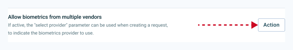
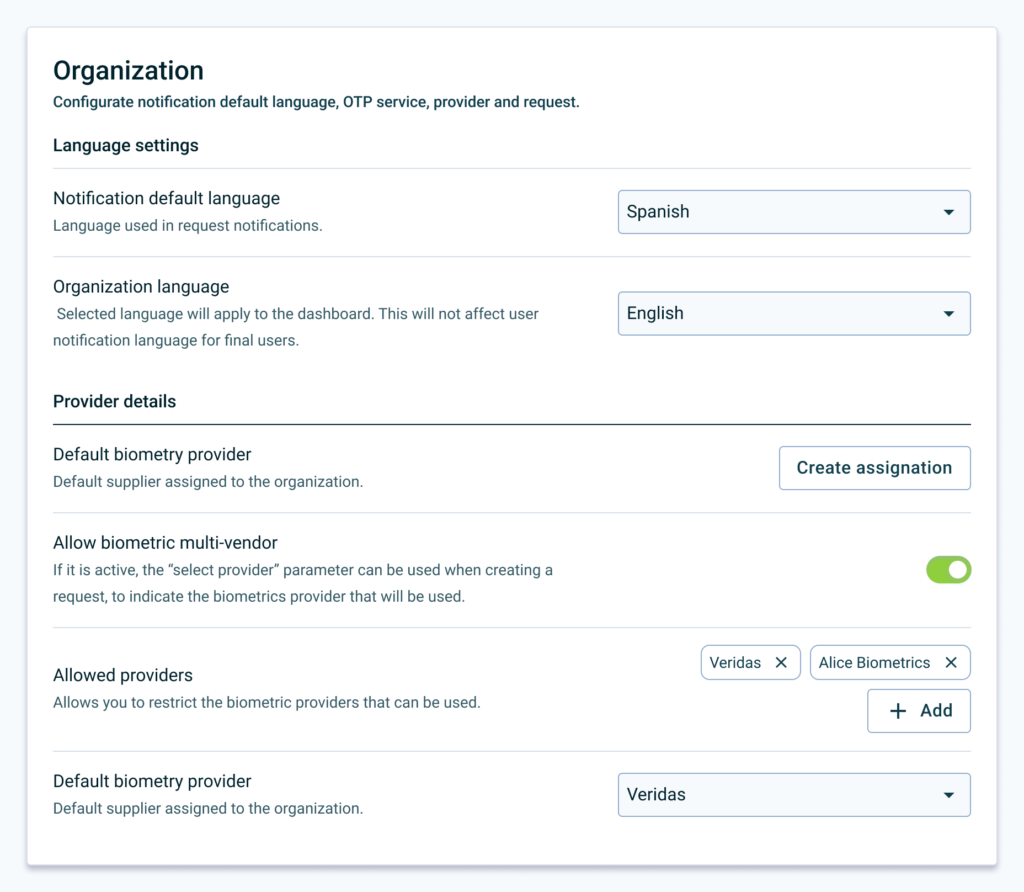
Through previous interviews, the team found that both internal and external administrative users could have problems completing different settings regarding digital signature request, biometry proof-of-life request, and digital certificates:
They have to look for documentation, and in the worst cases they need human help because the resources provided are not enough.
The OKR
One of the main OKRs of the year was to reinforce Signaturit’s positioning as a self-service product for SMEs. We saw a relation between the opportunity and this goal: reducing user dependencies from our information sources will make them more autonomous.
How can we impact our OKR?
The team detected two main areas that can be addressed.
Time. In conversations with Sales and CS, we discovered that there could be a time frame of between 2 and 24 hours to give a response to a user, depending on the number of requests, resources and time of week, with the expenses that this entails.
Dropoffs. The user, as expected, cannot advance, or advances by making a configuration that does not meet his needs without him knowing it and subsequently has to edit it, losing time and credits in the process.
As for this scenarios, we decided to aim to reduce by % the number of tickets received by Support requesting administration or assistance tasks, so we can reduce the overall resources destined.
The User
Our admins user have to customize some settings and fill out form fields to personalize their experience with the Signaturit ecosystem. We can impact in two types of users:
External user: manager or company account administrator.
Internal user: Signaturit employee assigned to a company that performs the configuration.
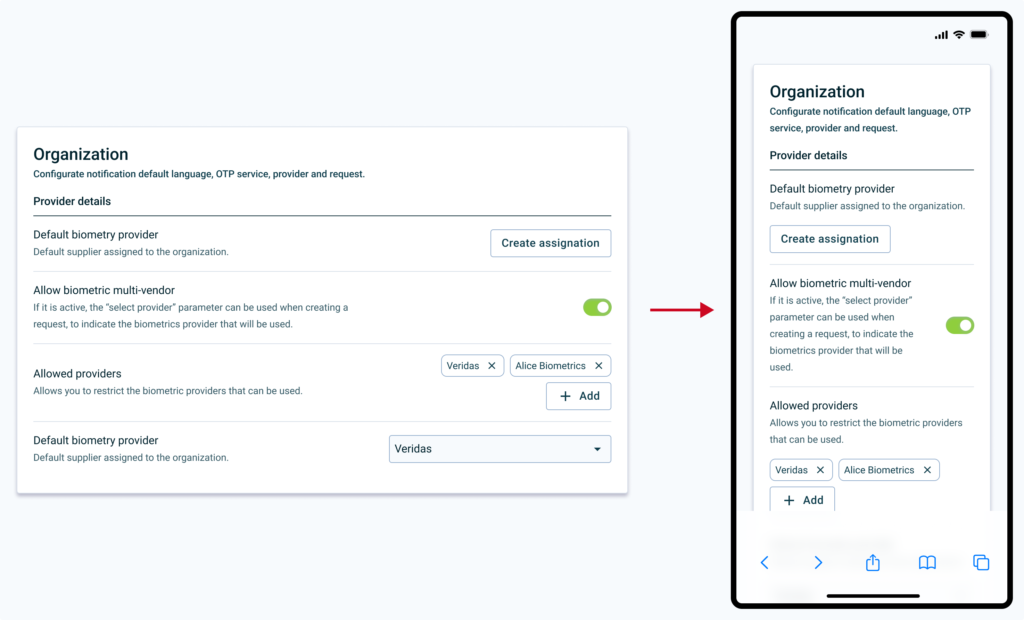
Interface context
Most updated version of the input component in use in the design system.
As seen in the image, in complex cases (advanced configurations, dense forms, etc.) the component does not have enough resources to describe advanced problems in such little context:
What type of data the user has to enter.
Data format.
Implications when input information is sent.
Discovery: what do we want to learn?
Based on the information that we have about the problem, the context, and the users we will focus in three discovery areas:
If there is a real relationship between the information and the user’s performance, and its impact.
Whether the information we provide in different contexts is sufficient for the user to resolve their problems.
How competitors interfaces work when making settings or filling out forms.
Based on the timeframe and the resources, we decided to conduct three methods to learn: competitors benchmark, heuristic analysis and user interviews.
Competitors Benchmark
Configuration formats have been analyzed considering content density, information architecture and visual properties (spacing, font hierarchy, etc.).
We identified two main highlights: similar hierarchies and horizontal layout.
7 of the 9 competitors analyzed use a similar hierarchy (vertical with a title and paragraph) of information in each input.6 out of 9 competitors analyzed place the input next to the label and the information.
The information is dispersed and is not easy to cluster. The cognitive load on the user may be large enough to be a problem as they have to remember information from different sources.
The interface does not prevent error prevention. There are configurations that can be critical to launching different processes and the user does not have enough information or tools to manage them.
Interviews
We interviewed both internal and external admins. This is a glimpse of what they said:
“To go from one field to another solving and filling out any configuration, for me it is important that it be simplified, and that the steps are very clear.“
“If the information was more organized, I could figure things out on my own.“
“If I am not shown information, learning the platform is too tedious and I stop being autonomous.“
“Perhaps it would be better that I have the information coming to me, rather than me going to the information.“
After hearing them, our findings were clear:
Lack of information. 7 out of 11 have had to be assisted at some point, both passively (user manual or help center) and actively (CS contact).
Visibility. 9 out of 11 users had problems finding information for a specific field that they were unable to configure.
Discovery Insights
We can conclude that users need contextual information to complete configurations, as they find it unproductive to have to review documentation to ensure that the configuration is correct.
This generates expenses in terms of resources (technical support, customer success, etc.), and creates friction in the configuration funnels.
Definition
For the best understanding of the information provided, we will focus on:
Provide enough prose to the user, in the right context.
Reuse current components and structures for the MVP component and avoid over-design.
Prototyping
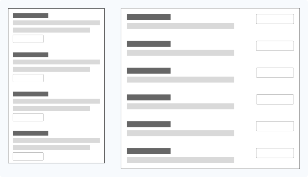
Based on the information architecture patterns observed in the benchmark, we can identify two basic types of organization on desktop displays: column-based and row-based:
Column-based layout (left) and row-based layout (right).
In first iterations with different inputs and text lengths currently in use in the help center, we see that a lot of inconsistency is created in the spaces depending on the layout (full width or narrow paragraph), making it difficult to read the elements individually:
Comparison of both full width and narrowed paragraph layouts.
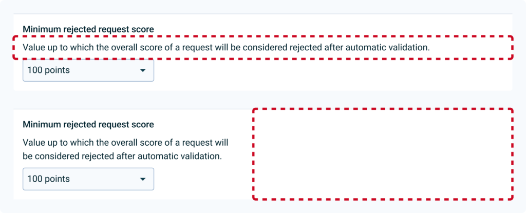
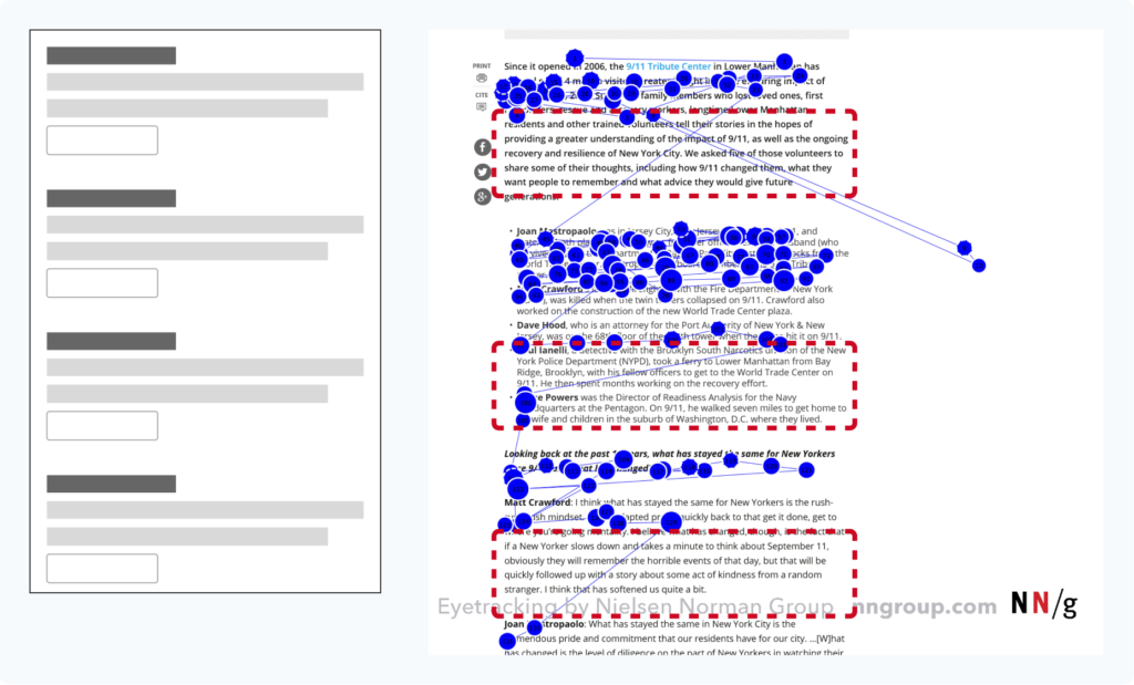
In addition, both create a large block of information that may be poorly scannable, causing the user to miss part of the content, as we see in the F pattern in the image:
Column display pattern and F-shaped pattern for reading where we can see a lot of information that might not be read (red dashed rectangles).
On the other hand, by using the completely horizontal organization, we can see that the interface is better balanced, although there is still a lot of imbalance between the text and the inputs:
That is why in the next iteration it was decided to limit the spaces in columns, to generate more visual rhythm and distribute the weight of the space occupied by the information on the left:
50/50 distribution of text and input.
In the next iteration it was considered to maintain a 50/50 column structure, but finally it was decided to give more space to the text, limiting the second column to 40% of the total space, to generate more visual rhythm and distribute the space. Weight of the space occupied by the information on the left. The help text is also toned to create more contrast between different information and promote a layer-cake reading pattern:
iteration from a 50/50 layout to a 60/40.
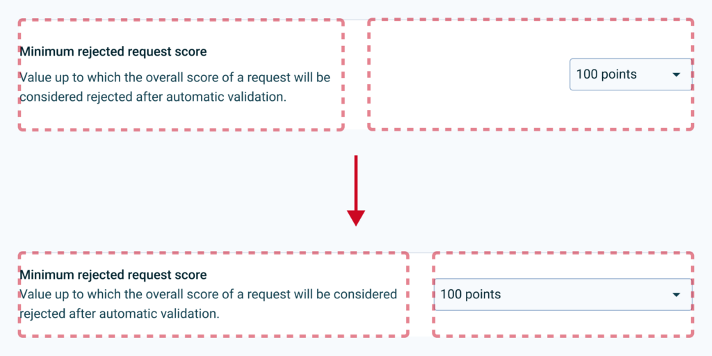
It is decided that elements that do not occupy the entire width of the column are aligned to the left, to improve the balance of the rows:
60/40 layout with the input fully aligned to the right.
Elements can be grouped into cards to give more context and separated into sections with titles headings and a better contrast separator.
After considering various use cases, we started working on testing different input type arrangements.In terms of scalability, we can take it to smaller devices where each configuration can adapt the screen according to its nature (for example, toggle or multiple selection):
Test: How do we measure success?
Short term
The user must complete different configurations and assign a value to understanding (1 is understood, 5 is not understood).
Task completion time.
Long therm
Comparison across different products of the task completion rate and understanding rate of the old and new interface.
Reduction of tickets and visits to the help center.
Test Learnings
Improved understanding. After user testing, we saw an increase in comprehension rate. Also, the users complete the setups slightly faster.
What Went Wrong
During the research, we identified two global flaws that are transversal to our products. This
Admin as key target. As we lacked the full point of view of this user cohort, we needed to approach the research from a further starting point. We have to get closer to administrator users, since it is a key profile to unlock the entire user journey of operator and end user.
Obsolete documentation. When analysing all the documentation inside and outside the product, we identified a debt in the documentation process of some features. ****Knowing that there is good documentation if we look at the big picture, does not mean that it does not have to be maintained or improved.
Next Steps
Unmoderated MVP. Small products will be tested in controlled environments to collect quantitative data on selected configurations.
Heatmapping. We need heatmap information on a selected, conflicting configuration flow to be able to validate that users are browsing in the pattern we expected.
To Wrap Up
In conclusion, this case study has shed light on the need for context-specific information for configuration processes. By providing clearer, more accessible information, we can enhance user autonomy and productivity, decrease reliance on support resources, and improve overall user experience. Going forward, we will continue to monitor the impact of these changes and adapt our approach as necessary to ensure we are meeting user needs and achieving our goals. Thanks for reading this far!
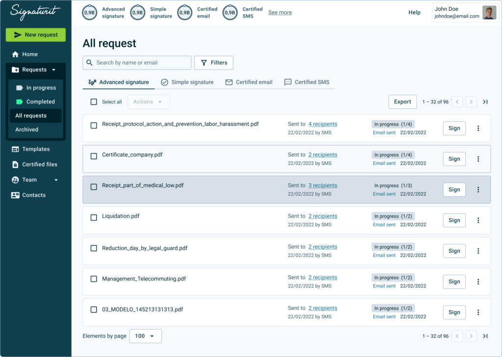
At Signaturit, I led the redesign of the request list experience, the platform’s highest-traffic surface and a core operational tool for customers managing large volumes of signature requests.
Rather than treating this as a UI improvement, the work addressed a systemic mismatch between information architecture and users’ mental models, which was impacting trust, efficiency, and long-term adoption.
🚫 Due to data policy with the company, detailed information on some specifications, processes or designs is not provided.
Impact
-1.2
perceived difficulty score
25%
faster information scanning
~17%
Credit consumption increase estimated
Increased user confidence in managing high-volume signature workflows.
Faster scanning and decision-making in a critical operational surface.
Reduced cognitive load by aligning with familiar, inbox-like mental models.
Positive downstream impact on conversion and credit consumption.
Improved maintainability and scalability of a core UI component.
Summary
🧍🏽
11 participants
✏️
1 designers
👥
3 teams
⌛
2 weeks
Situation
The request list is the most visited screen in the product and functions as an operational control center for many customers. Some accounts manage hundreds of active requests per day, making even small inefficiencies compound quickly.
Research and internal signals showed that users lacked confidence in the state of their requests, especially in the absence of explicit notifications. This uncertainty translated into stress, repeated checking, and reduced trust in the system.
Tasks
Identify the structural causes behind user uncertainty, beyond surface-level usability issues.
Understand how users build context and confidence when managing large volumes of requests.
Align the experience with scalable mental models used in adjacent tools (email, inboxes, task lists).
Deliver a solution that could be validated quickly and extended safely over time.
Actions
Synthesized insights from user interviews, CS feedback, and sales input to frame the problem systemically.
Led pattern analysis to identify alternative, common information hierarchies in the user ecosystem.
Based on the information architecture patterns that we know Giselle uses in her daily life for hours (Gmail, Outlook, chats), we are interested in ensuring that the reading model of our platform adapts to what she is used to.
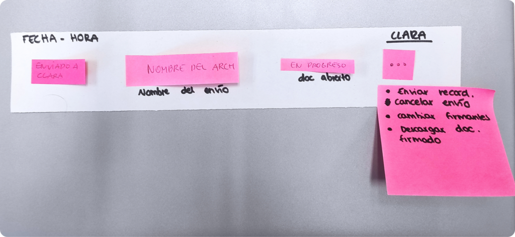
Facilitated an information architecture workshop to surface users’ mental models.
After an introduction and some contextual questions, we show users different postits representing interface elements (request name, status, etc.). In addition, we offer them blank post-its so that they can create elements themselves if they see it necessary. Then, they have to arrange the elements so we can identify mental models.
Defined principles focused on scanability, comparability, and decision confidence:
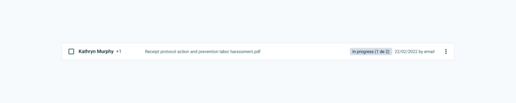
The “Receipt information risks” file has been sent to 2 recipients by mail on February 22, 2022. It is in progress (one person left to sign, email opened on February 24, 2022).Kathryn and one other recipient have received “Receipt information risks.” It is in progress (There is one person left to sign). It was sent on February 22, 2022 by email.
Results
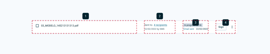
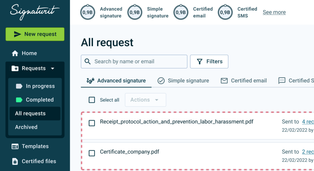
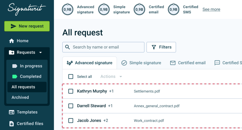
Partnered with engineering to redesign the architecture while reducing component complexity, from this:
To this, increasing information density without sacrificing clarity:
Considering the feedback received,a first proposal is made to test with users, maintaining the number of columns but redistributing the elements to improve readability and decision making.
Improved ability to compare multiple requests within the same view:
Previous layout.
Redesigned layout, with improved visibility.
Users located critical information faster and with less perceived effort.
Strong qualitative validation from users and internal stakeholders.
A leaner component structure supporting future extensions.
Next Steps
Validate performance in extreme usage scenarios with large recipient sets.
Measure long-term confidence through in-app surveys.
Apply the same mental-model-driven approach to other core product surfaces.
Thoughts & Self-reflections
Early user involvement is fast, low-cost, and highly effective.
Well-structured workshops are a powerful way to uncover real mental models.
Small changes in information architecture can have a significant impact on user confidence and efficiency.
Aligning product patterns with familiar tools in B2B tools (email, inboxes, chats) reduces friction and learning effort.