Advanced settings improvements

This case study presents a possible solution to the friction points detected by the team in the forms and configuration settings from different funnels.
🚫 Due to data policy with the company, detailed information on some specifications, processes or designs is not provided.
Summary
🧍🏽
11 users
✏️
2 designers
👥
4 teams
⌛
2 weeks
Impact
🧍🏽
Generated a better understanding of user input and expectations by changing a setting.
📈
Defined potential resource savings in customer service and support by improving user productivity and reducing the learning curve.
🧑🏽💻
solid impact for a scalable and cross-functional solution for our design system and different products.
Opportunity Detection
Through previous interviews, the team found that both internal and external administrative users could have problems completing different settings regarding digital signature request, biometry proof-of-life request, and digital certificates:
They have to look for documentation, and in the worst cases they need human help because the resources provided are not enough.
The OKR
One of the main OKRs of the year was to reinforce Signaturit’s positioning as a self-service product for SMEs. We saw a relation between the opportunity and this goal: reducing user dependencies from our information sources will make them more autonomous.
How can we impact our OKR?
The team detected two main areas that can be addressed.
- Time. In conversations with Sales and CS, we discovered that there could be a time frame of between 2 and 24 hours to give a response to a user, depending on the number of requests, resources and time of week, with the expenses that this entails.
- Dropoffs. The user, as expected, cannot advance, or advances by making a configuration that does not meet his needs without him knowing it and subsequently has to edit it, losing time and credits in the process.
As for this scenarios, we decided to aim to reduce by % the number of tickets received by Support requesting administration or assistance tasks, so we can reduce the overall resources destined.
The User
Our admins user have to customize some settings and fill out form fields to personalize their experience with the Signaturit ecosystem. We can impact in two types of users:
- External user: manager or company account administrator.
- Internal user: Signaturit employee assigned to a company that performs the configuration.
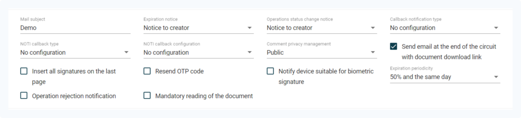
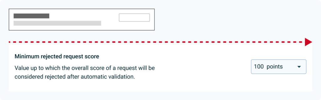
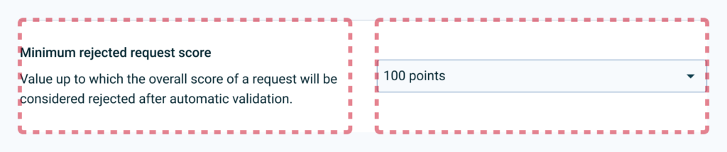
Interface context
As seen in the image, in complex cases (advanced configurations, dense forms, etc.) the component does not have enough resources to describe advanced problems in such little context:
- What type of data the user has to enter.
- Data format.
- Implications when input information is sent.
Discovery: what do we want to learn?
Based on the information that we have about the problem, the context, and the users we will focus in three discovery areas:
- If there is a real relationship between the information and the user’s performance, and its impact.
- Whether the information we provide in different contexts is sufficient for the user to resolve their problems.
- How competitors interfaces work when making settings or filling out forms.
Based on the timeframe and the resources, we decided to conduct three methods to learn: competitors benchmark, heuristic analysis and user interviews.
Competitors Benchmark
Configuration formats have been analyzed considering content density, information architecture and visual properties (spacing, font hierarchy, etc.).
We identified two main highlights: similar hierarchies and horizontal layout.
Heuristic Analysis
Based on the Nielsen’s Heuristics the team identified flaws in several aspects, such as error prevention, help users recognize, diagnose, and recover from errors, and help and documentation. We concluded that:
- The information is dispersed and is not easy to cluster. The cognitive load on the user may be large enough to be a problem as they have to remember information from different sources.
- The interface does not prevent error prevention. There are configurations that can be critical to launching different processes and the user does not have enough information or tools to manage them.
Interviews
We interviewed both internal and external admins. This is a glimpse of what they said:
“To go from one field to another solving and filling out any configuration, for me it is important that it be simplified, and that the steps are very clear.“
“If the information was more organized, I could figure things out on my own.“
“If I am not shown information, learning the platform is too tedious and I stop being autonomous.“
“Perhaps it would be better that I have the information coming to me, rather than me going to the information.“
After hearing them, our findings were clear:
- Lack of information. 7 out of 11 have had to be assisted at some point, both passively (user manual or help center) and actively (CS contact).
- Visibility. 9 out of 11 users had problems finding information for a specific field that they were unable to configure.
Discovery Insights
We can conclude that users need contextual information to complete configurations, as they find it unproductive to have to review documentation to ensure that the configuration is correct.
This generates expenses in terms of resources (technical support, customer success, etc.), and creates friction in the configuration funnels.
Definition
For the best understanding of the information provided, we will focus on:
- Provide enough prose to the user, in the right context.
- Reuse current components and structures for the MVP component and avoid over-design.
Prototyping
Based on the information architecture patterns observed in the benchmark, we can identify two basic types of organization on desktop displays: column-based and row-based:
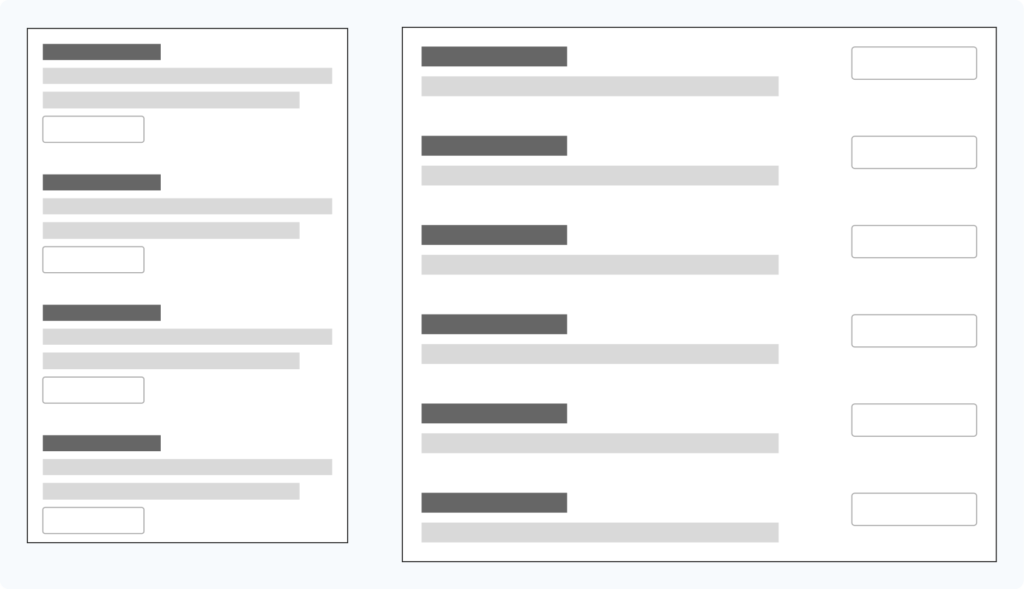
In first iterations with different inputs and text lengths currently in use in the help center, we see that a lot of inconsistency is created in the spaces depending on the layout (full width or narrow paragraph), making it difficult to read the elements individually:
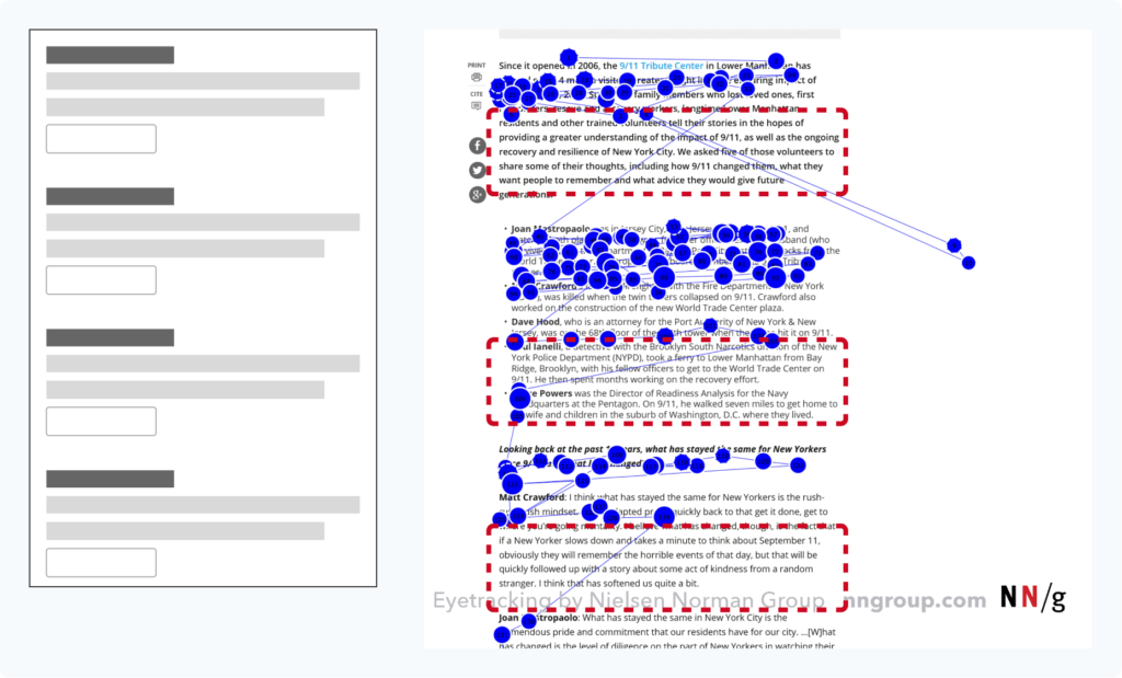
In addition, both create a large block of information that may be poorly scannable, causing the user to miss part of the content, as we see in the F pattern in the image:
On the other hand, by using the completely horizontal organization, we can see that the interface is better balanced, although there is still a lot of imbalance between the text and the inputs:
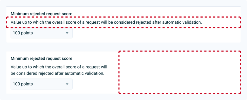
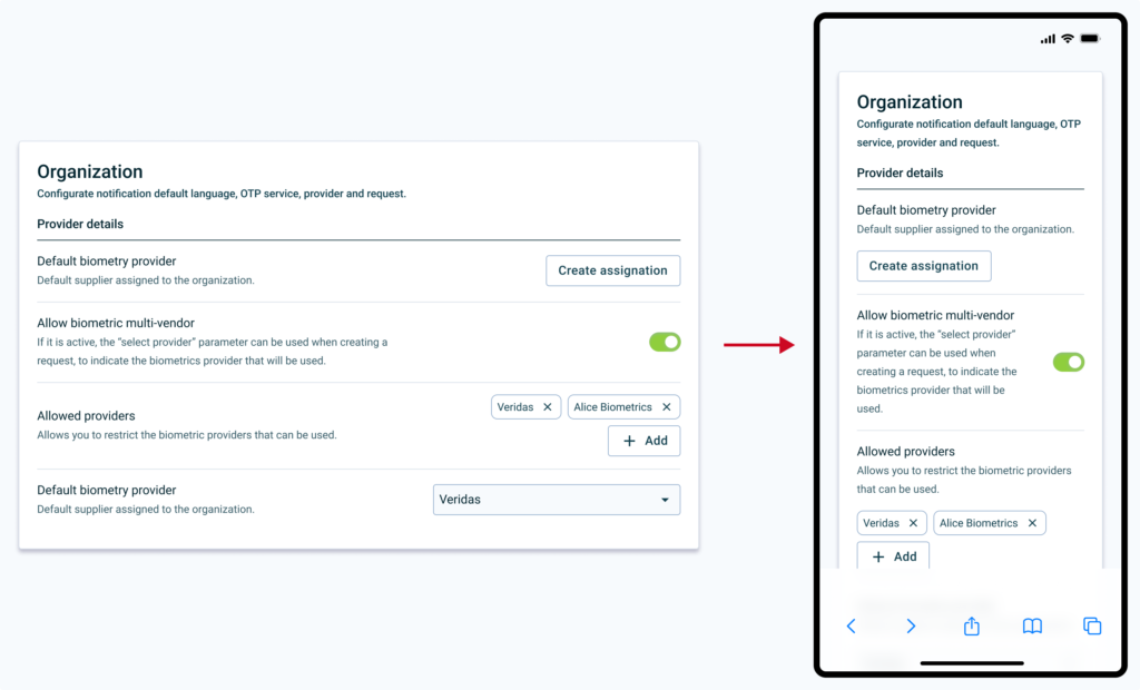
That is why in the next iteration it was decided to limit the spaces in columns, to generate more visual rhythm and distribute the weight of the space occupied by the information on the left:
In the next iteration it was considered to maintain a 50/50 column structure, but finally it was decided to give more space to the text, limiting the second column to 40% of the total space, to generate more visual rhythm and distribute the space. Weight of the space occupied by the information on the left. The help text is also toned to create more contrast between different information and promote a layer-cake reading pattern:
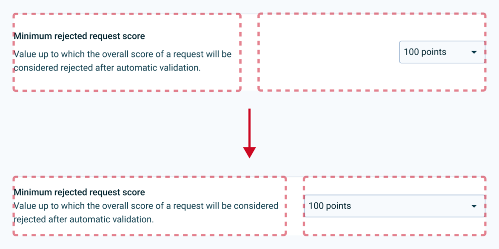
It is decided that elements that do not occupy the entire width of the column are aligned to the left, to improve the balance of the rows:
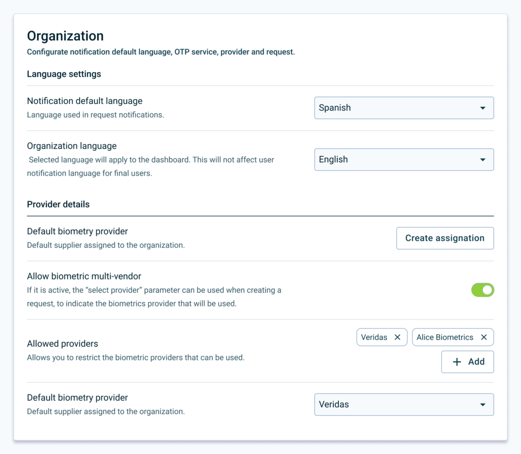
Elements can be grouped into cards to give more context and separated into sections with titles headings and a better contrast separator.
Test: How do we measure success?
Short term
- The user must complete different configurations and assign a value to understanding (1 is understood, 5 is not understood).
- Task completion time.
Long therm
- Comparison across different products of the task completion rate and understanding rate of the old and new interface.
- Reduction of tickets and visits to the help center.
Test Learnings
Improved understanding. After user testing, we saw an increase in comprehension rate. Also, the users complete the setups slightly faster.
What Went Wrong
During the research, we identified two global flaws that are transversal to our products. This
- Admin as key target. As we lacked the full point of view of this user cohort, we needed to approach the research from a further starting point. We have to get closer to administrator users, since it is a key profile to unlock the entire user journey of operator and end user.
- Obsolete documentation. When analysing all the documentation inside and outside the product, we identified a debt in the documentation process of some features. ****Knowing that there is good documentation if we look at the big picture, does not mean that it does not have to be maintained or improved.
Next Steps
- Unmoderated MVP. Small products will be tested in controlled environments to collect quantitative data on selected configurations.
- Heatmapping. We need heatmap information on a selected, conflicting configuration flow to be able to validate that users are browsing in the pattern we expected.
To Wrap Up
In conclusion, this case study has shed light on the need for context-specific information for configuration processes. By providing clearer, more accessible information, we can enhance user autonomy and productivity, decrease reliance on support resources, and improve overall user experience. Going forward, we will continue to monitor the impact of these changes and adapt our approach as necessary to ensure we are meeting user needs and achieving our goals. Thanks for reading this far!